

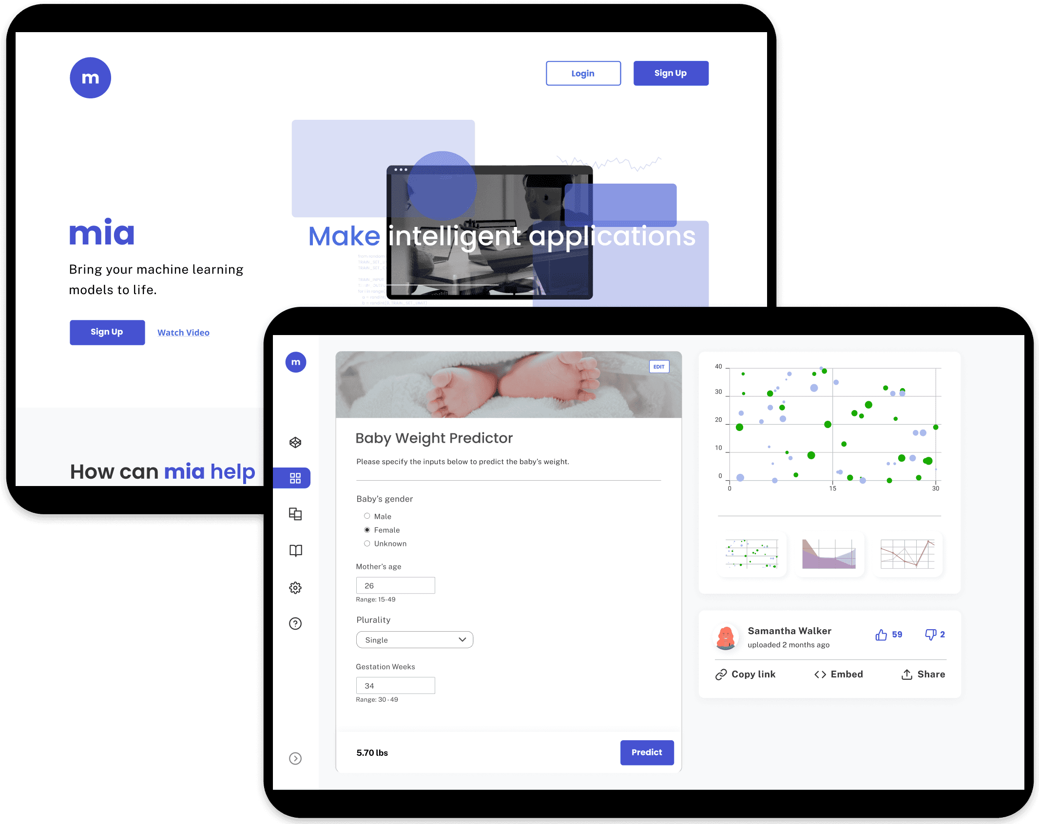
mia, a Machine Learning Platform

Data scientists specialize in creating machine learning models that can predict real-world data or make data-driven recommendations based on input data; but deploying these models require more than just science. Redapt reports that 90% of machine learning models never make it to production. The reason being is that majority of data scientists do not have the required skill set to deploy their models.
mia (Make Intelligent Applications) is an online platform that helps users to deploy their machine learning models into web applications simply and quickly via forms, eliminating the need for front-end development.
mia tasked our team to redesign their landing page and forms (uploading a model and app creation) so that mia can attract users and increase user engagement.
On top of their redesign goals, they wanted mia's brand to express fun and their app creation form to be reinvented into something more interactive (i.e. website builder).
Role
UX Designer
Applications


Focus Areas
User Research
Design Systems
Animation
Client Feedback
April 20, 2021
This has been an amazing experience. It’s amazing to see it all come to fruition. Congratulations you really did an amazing job with this.
Reply
Analyzing mia
We discovered that the user flow had at least 15 steps, which excludes the additional steps caused by potential errors and the number of inputs users need to add for their app.
We carried out two rounds of interviews with 30 data scientists, the first one focusing on the usability of the website through contextual inquiry and the second one learning about mia’s users thoughts, frustrations, and motivations.


We created a persona, James the data scientist, and his journey with mia’s current website from our interviews’ key findings.
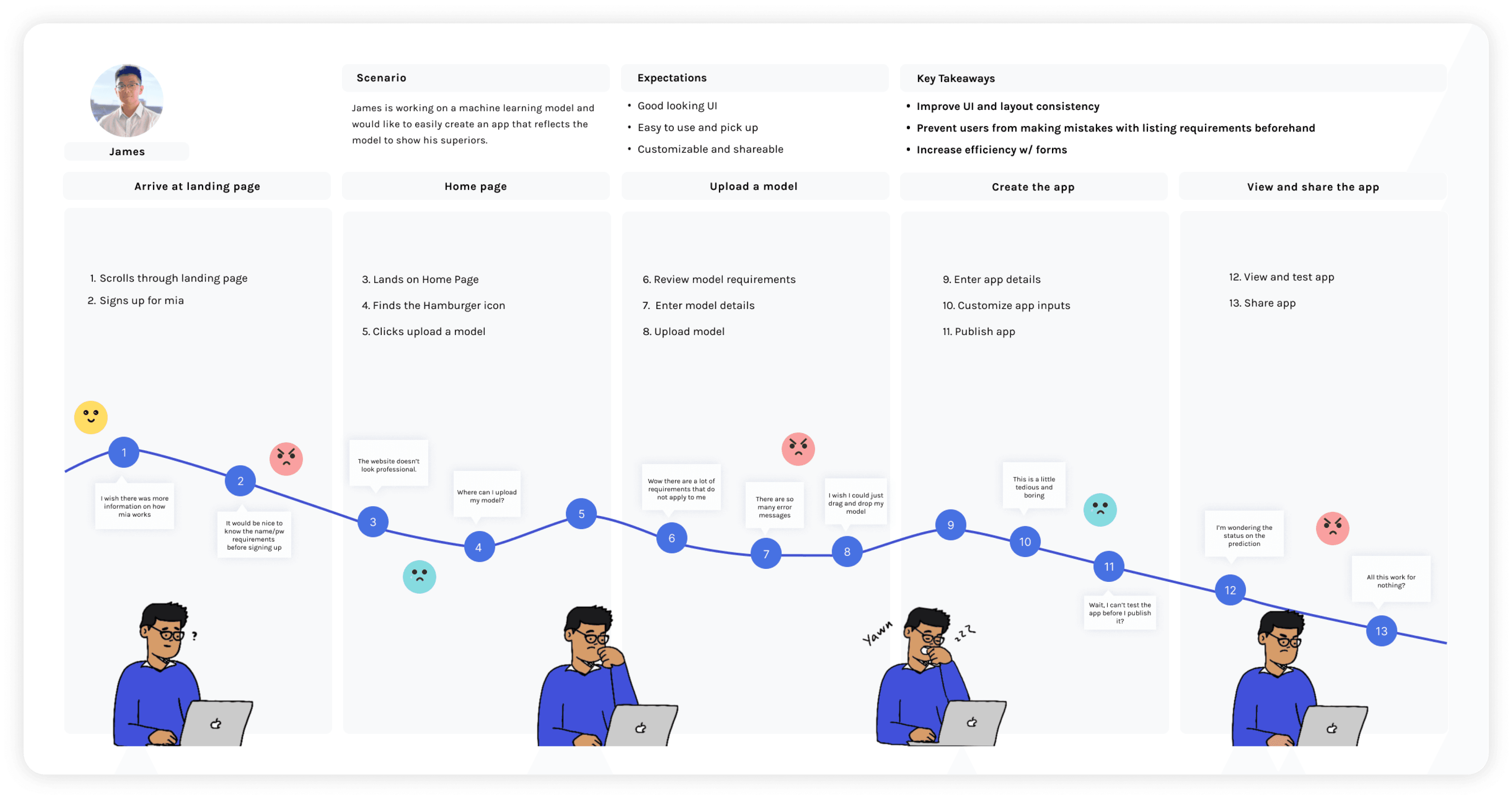
From our user's journey, these are our 4 key opportunities to solve our challenge:


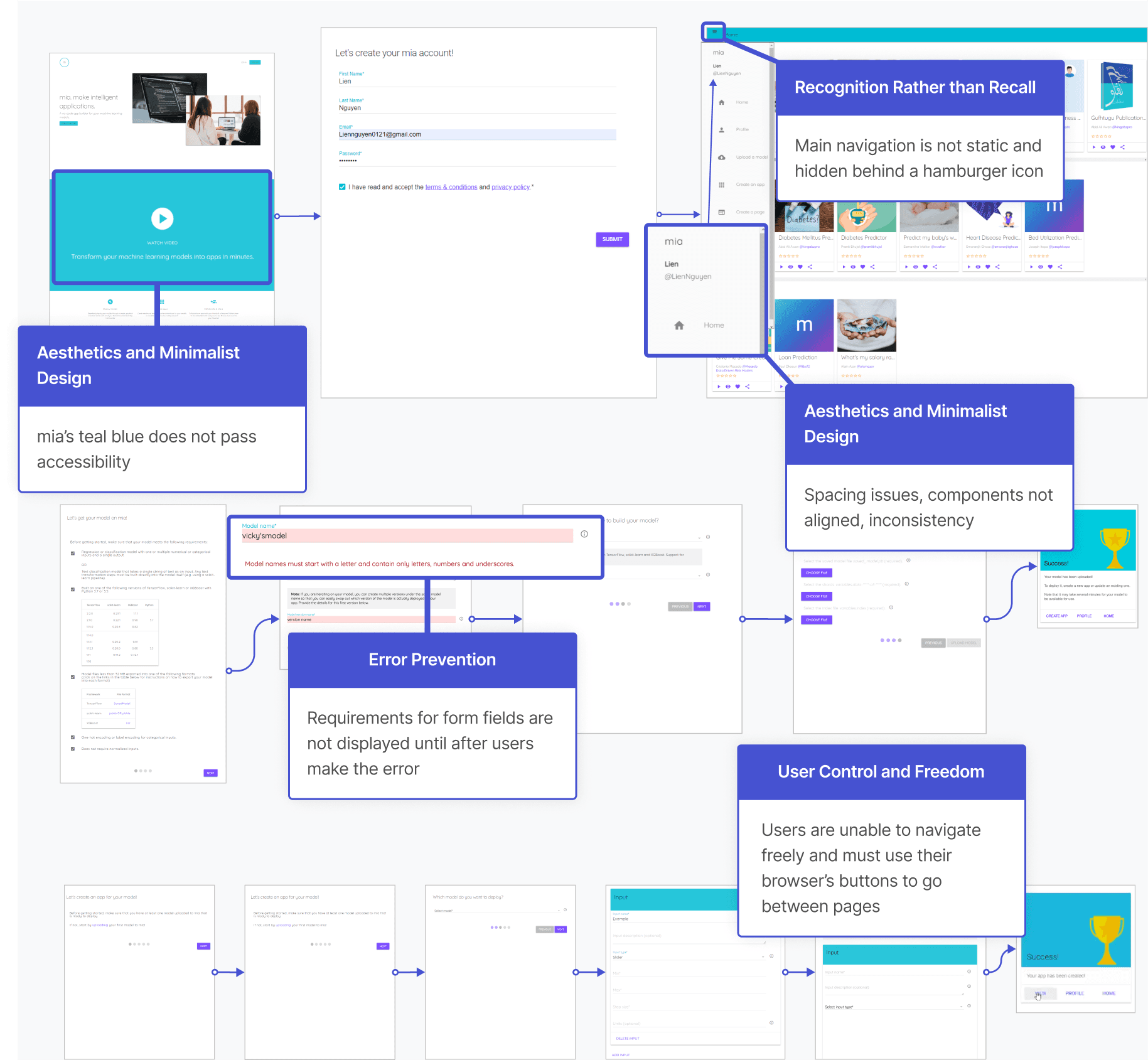
Key Opportunity 1
Add more information to mia’s landing page
Our users wanted more information on how mia works from the landing page. The video and the short descriptions of its main three benefits were not enough to engage users.
We compared companies that offered similar services to mia and focused on how they presented their features.
From our competitive analysis, mia's landing page lacks detailed descriptions of their features, benefits to using their platform, testimonials from users or companies


Offers interactive visuals to show what the process would look like
Landing page has great visuals and exciting colors to entice users in learning more
Offers a systematic breakdown of what their product offers
Easy to follow headlines
Testimonials from customers working at big name companies
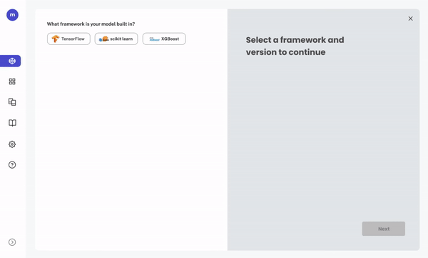
Improve the efficiency of uploading your model
To make the form short and simple, we created a one-screen form where users could interact with the checklist of requirements, selecting their framework and version. The upload requirements would tailor to their selections. As a result, users would only read the information that pertains to their model.
Key Opportunity 3
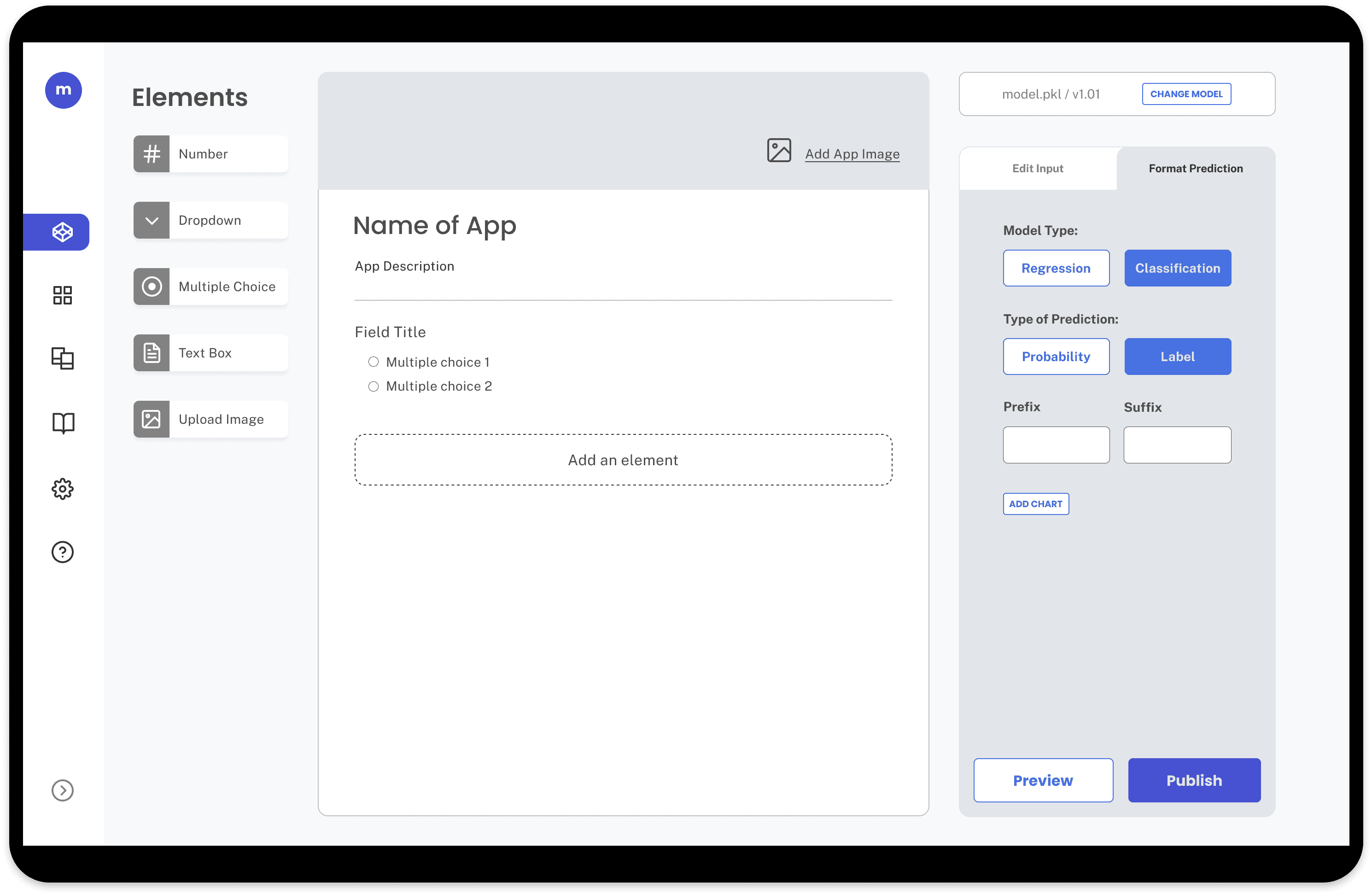
Reinvent the app creation process
We moved away from mia’s traditional form design and redesigned the app creation process to be customizable “builder” experience.
Users can drag and drop inputs to the app form and edit the inputs on the side panel. Design offers more of a "Do-It-Yourself" feel.
We conducted A/B testing between this design and others, and as a result, 8 out of 8 users preferred the “builder” experience.
Before

After

Implement Design System
All interviews mentioned that mia’s platform lacked trustworthiness because of its UI flaws. I developed a design system to ensure consistency and professionalism throughout.


mia chose "Quicksand" as its primary font for its roundness. However, they dislike bolding the font for their headers due to its "comicy" look with its curved edges. As a result, users lack direction or CTA when viewing mia's content since all the headers and paragraphs and have the same weight.
I looked at other options and recommended to go with "Poppins" for the headers.
H1
H2
H3
H4
H5
H6
To make sure components are properly aligned, I created a spacing guide.

** not all designs are shown
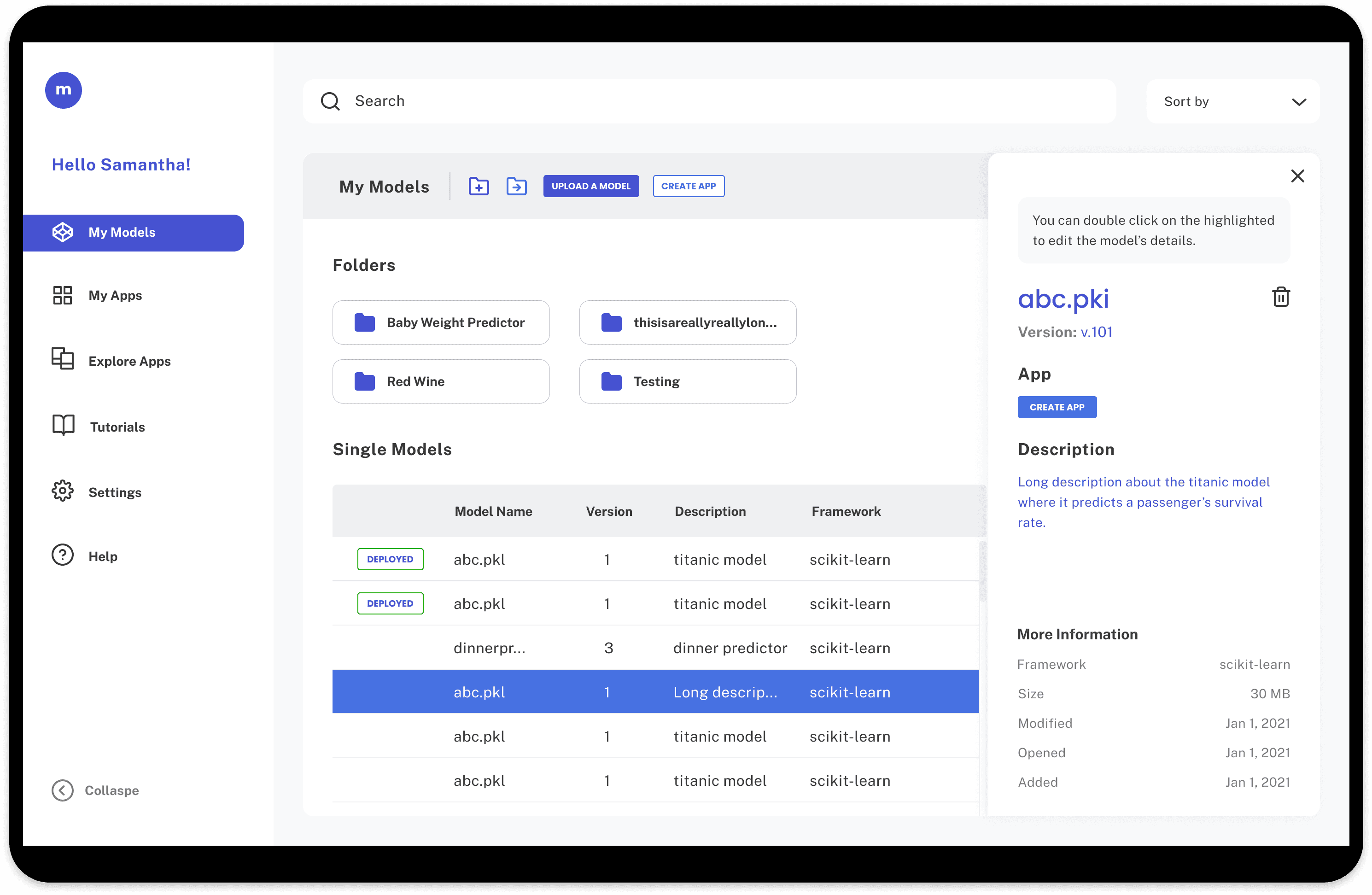
Upload a Model

Models
App Builder
© 2025 Lien Nguyen